The following five principles of good map design were summarised and illustrated in an article by Aileen Buckley in 2012 and are an excellent starting point for practical tips when laying out your maps. The article “Make Maps People Want to Look At” is an excellent read and contains many more examples and further reading.
You don’t need to be an expert cartographer to produce maps in QGIS but demonstrating an awareness of these principles will help you to make clearer, more legible maps that communicate their purpose in a more meaningful way to your reader.
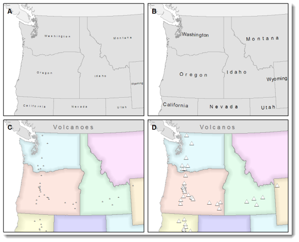
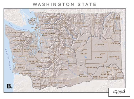
Legibility
Definition: The ability for elements within a map to be seen and understood.
Design: Symbols and text should be effortlessly seen and easily understood
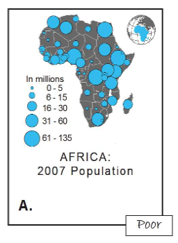
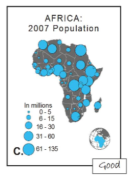
visual Contrast
Definition: The level of contrast between map elements and the background.
Design: A well designed map with a high degree of contrast gives a clean, sharp result.
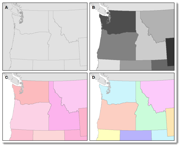
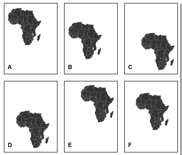
Figure Ground
Definition: The level of visual separation between the subject and the background.
Design: Good figure-ground balance focuses the eye of the reader on the subject

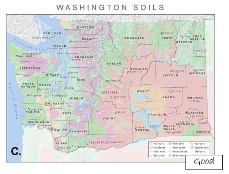
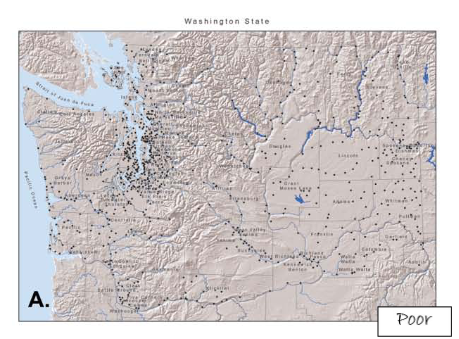
hierarchical Organisation
Definition: The internal graphic structure and layout that allows the reader to make judgements about relative importance.
Design: Reference maps and thematic maps are approached differently under this principle.
balance
Definition: A page that balances the map and elements such as title, legend, scale well is easier to read.
Design: Imagining the centre of the page as a fulcrum and each element of the map as a factor that tips the map in a particular direction.
This short video from Brian Krouse is a great revision resource for the design principles above. Take 10 minutes to listen through to embed your learning before moving on to the practical workshop on making maps.